
Countless possibilities
The Countless Possibilities website is a political platform that aims to professionally and clearly convey ideas, projects, and actions that have an impact. It acts as a center for stakeholders to discuss tactics, successes, and empowering insights, including legislators, policymakers, and the general public. The design, which features a bold and clean style with a well-chosen color scheme and expert typography, highlights authority and reliability. The website’s user-friendly navigation and well-organized content guarantee that visitors can quickly access pertinent material, including case studies, blogs, and tools to support political initiatives, encouraging participation and producing results that can be put into practice.
Problem
Despite being successful in its goal, the Countless Possibilities website may have had a number of issues with its previous design. One of these problems might be a lack of user-friendly navigation, which would make it challenging for users to swiftly reach important political information or insights.
It’s possible that the visual design was out of date, with uneven fonts, imbalanced layouts, or an uninspired color scheme that didn’t match the website’s authoritative goal. Poor performance on mobile devices may have limited its appeal to a wider audience, raising concerns about responsiveness.
It’s also possible that the content layout was imprecise, overloading consumers with disorganized sections or missing a distinct hierarchy to direct their path. Ineffective call-to-actions or a lack of interactive elements could have resulted in low levels of interaction, which would have decreased user engagement.
Solution
Solutions Implemented for Countless Possibilities Website
A number of calculated changes were made to the Countless Possibilities website to improve user experience and overall functionality in order to address the issues found there. In order to produce a more effective and significant platform for political engagement, these solutions concentrated on enhancing navigation, design, content organization, responsiveness, interaction, and performance.
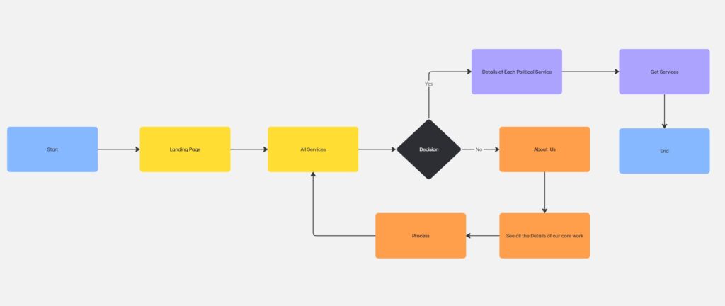
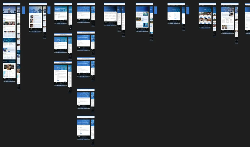
User flow
Design
Solution from a Design Perspective
The Countless Possibilities website experienced a number of significant design changes to produce a more sophisticated, approachable, and captivating platform that complemented its political theme. These updates were thoughtfully designed to improve the website’s usability and aesthetic appeal, giving users a smooth and polished experience.
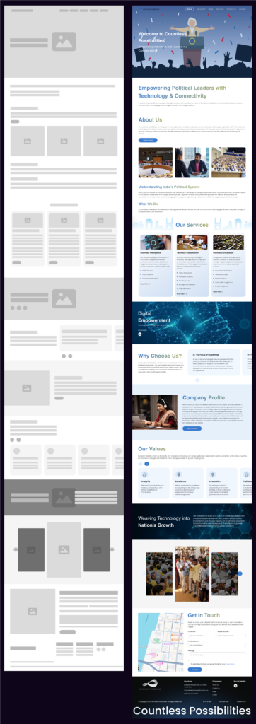
What should be there in Landing Page
- Meaningful landing page which shows all the data like Our Services, Blogs, About us and contact us.
- Each Service have their own agendas and those can be explained clean and neatly.
- Sophisticated approach for every user and politicians.
What shouldn't be there in Landing Page
- This website consists of only single page design.
- No proper details regarding countlesspossibilities
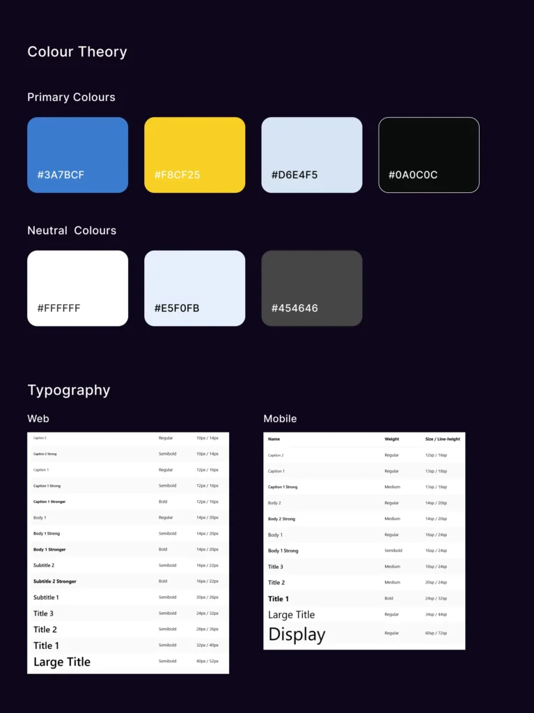
Design System
Project Handover to Developers
The Countless Possibilities website is now prepared for production after the design enhancements were finished. Functionality, user interaction, and smooth operation on all platforms have all been prioritized in the design. The code must accurately integrate the main design components, such as the mobile-first responsiveness, streamlined navigation, and aesthetically pleasing layout. To improve user involvement, interactive elements including call-to-action buttons, hover effects, and dynamic animations should be included. In order to guarantee quick loading times without sacrificing visual quality, performance enhancements like image compression and lazy loading strategies are crucial. It will be your responsibility as developers to implement this design using clear, effective code while preserving the user experience. Make sure the website has undergone extensive testing.
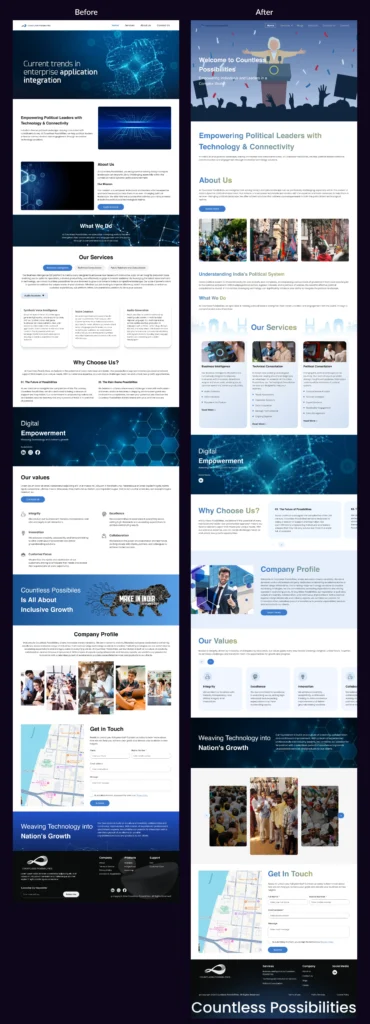
Final solution
In keeping with the site’s political orientation, the recently implemented clear and unified design system, which included a polished color scheme and carefully selected font, effectively communicated authority and trust. Information was easier to read and comprehend thanks to the layout’s simplification and clear content hierarchy, and users could easily locate pertinent content thanks to its user-friendly navigation.